com_palette
English | 日本語
Overview
com_palette demonstrates how to use the core webg/CommandPalette.js as a UI component independently of WebgApp. It places buttons, toggles, steppers, selects, and an exclusive mode switch in one palette and shows how command definitions connect to application state.
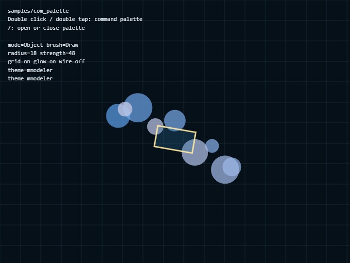
The center 2D preview and HUD read the same state that the palette updates. Switching Obj / Edit / Scpt changes both the active button and the preview. Toggle and stepper changes affect the background or shape on the next frame. This keeps application-specific state in the caller while CommandPalette only displays and updates it.
How to Run
- Open ./com_palette.html
- WebGPU is not used; the sample only requires a browser that supports Canvas 2D and the DOM
webg Features Used
CommandPalette: builds the palette DOM from command definitions and handles opening, pagination, and value displaygetDefaultCommandPaletteCss(): returns the default CSS so the sample can restore it after a style experimentsetStyle(): replaces the complete CSS applied to the palettesetTheme(): changes only color-related CSS custom propertiesattachToCanvas(): connects double click, double tap, and the/key to palette opening
Implementation Flow
state stores pause, grid, glow, wire, mode, brush, radius, strength, and theme. The command value functions and getCommandState read this object to display the current toggle, stepper, select, and mode-switch state.
Buttons are handled by onCommand, while toggles, steppers, and selects update state through onChange. Calling palette.render() and updating the HUD after changes keeps the palette, preview, and HUD synchronized. pageRows: 4 provides the global limit and pageRowsByPage: [4, 3] changes only the second page to three rows. Buttons count as one cell, while steppers and selects occupy a complete row.
Checkpoints
- Double click, double tap, and the
/key all open the same palette - Only one of
Obj / Edit / Scptis active and the center preview changes to the same mode - Toggle, stepper, and select changes appear in both the HUD and preview and remain visible after reopening the palette
Nextadvances through row-based pages without splitting a stepper or select rowCSSapplies the custom style andDefrestores the default CSS and theme
Controls
- Double click / double tap: command palette
/: command palette- Palette button: run command
- Obj / Edit / Scpt: switch modes, update the active color, and change the center preview
- Next: advance to the next row-based page
- Radius / Strength: stepper
- Brush / Theme: select row
- CSS: test
setStyle() - Def: restore default style